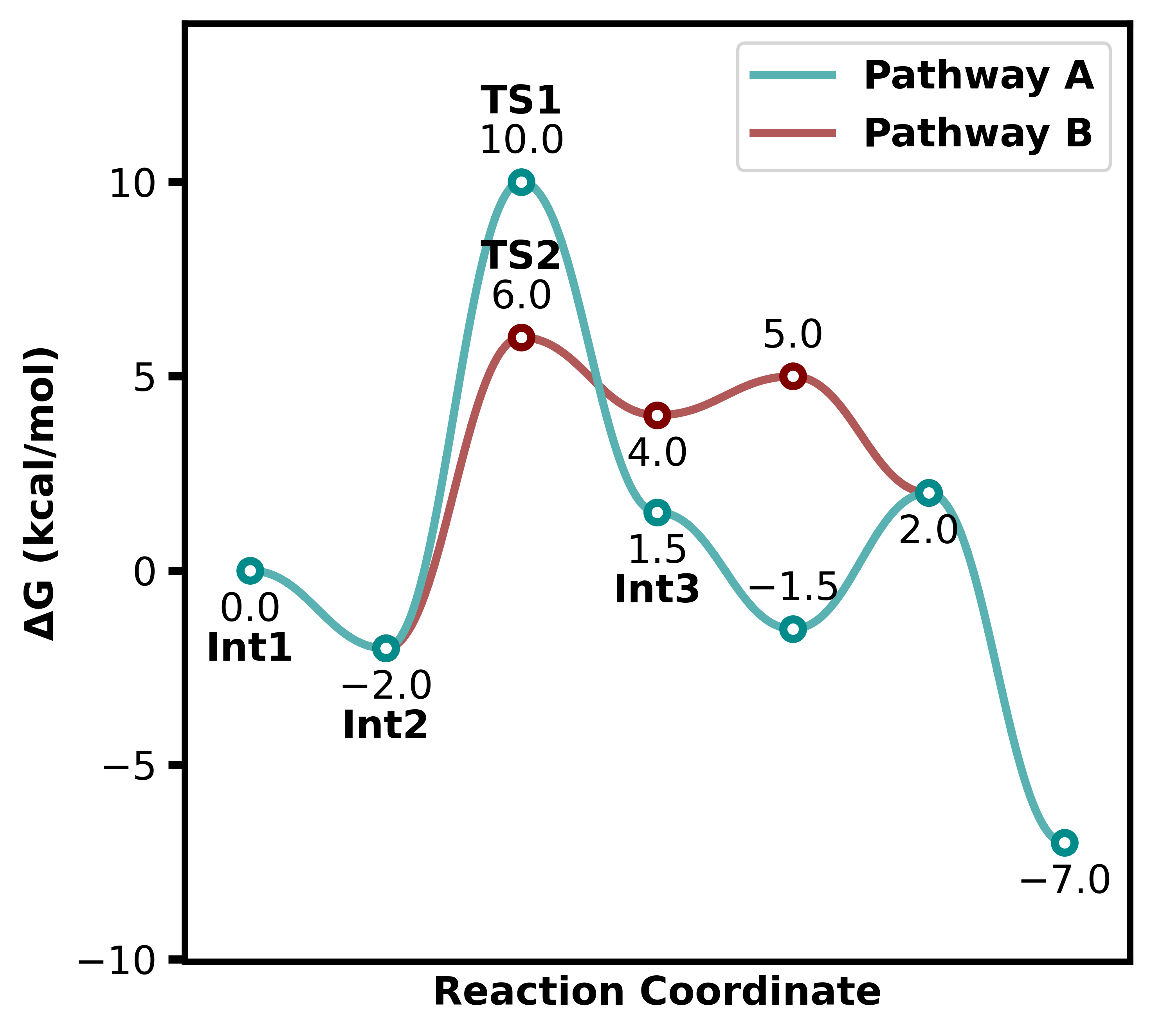
Plotting Customisation
Plotting Data
All examples use these data unless specified otherwise:
from plotprofile import ReactionProfilePlotter

energy_sets = {
    "Pathway A": [0.0, -2.0, 10.0, 1.5, -1.5, 2.0, -7.0],
    "Pathway B": [None, -2.0, 6.0, 4.0, 5.0, 2.0, None]
}
Parameters
This table summarizes the main plotting style parameters.
Parameter |
Default |
Description |
|---|---|---|
figsize |
[5, 4.5] |
Figure size in inches (width, height) |
point_type |
hollow |
Marker type for points (hollow, dot, bar, etc.) |
curviness |
0.42 |
Controls how curved the lines are |
desaturate |
True |
Whether to desaturate colors |
linestyle |
None |
mpl linestyle, or a dict keyed by series |
line_width |
2.5 |
Width of line plots |
bar_width |
3.0 |
Width of bars if using bar points |
show_legend |
True |
Display the legend |
colors |
[“darkcyan”, …] |
List of colors for lines |
annotation_color |
maroon |
Color for annotations |
energy |
G |
Type of energy plotted (G, H, E, etc.) |
units |
kcal |
Units of energy |
Examples
1. Axes Display
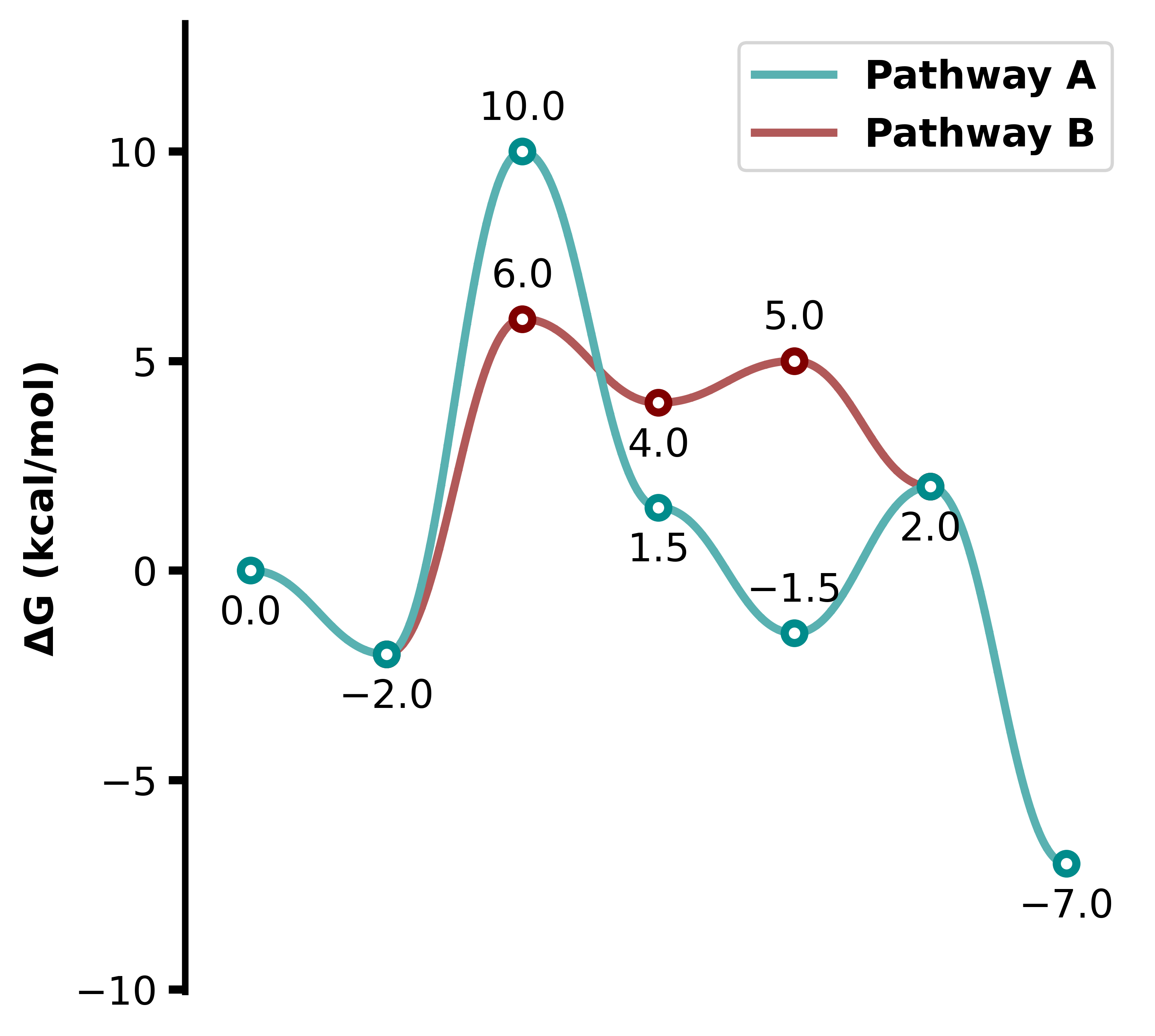
Axes can be shown selectively using the axes parameter:
axes='y'shows only the y-axis.axes='x'shows only the x-axis.axes='both'shows both axes.axes='box'shows 4 axes.axes=Nonehides both axes.
plotter = ReactionProfilePlotter(axes='y')
plotter.plot(energy_sets, filename="../images/profile13")
Parameter |
Value |
|---|---|
axes |
y |
2. Axis Labels and Units
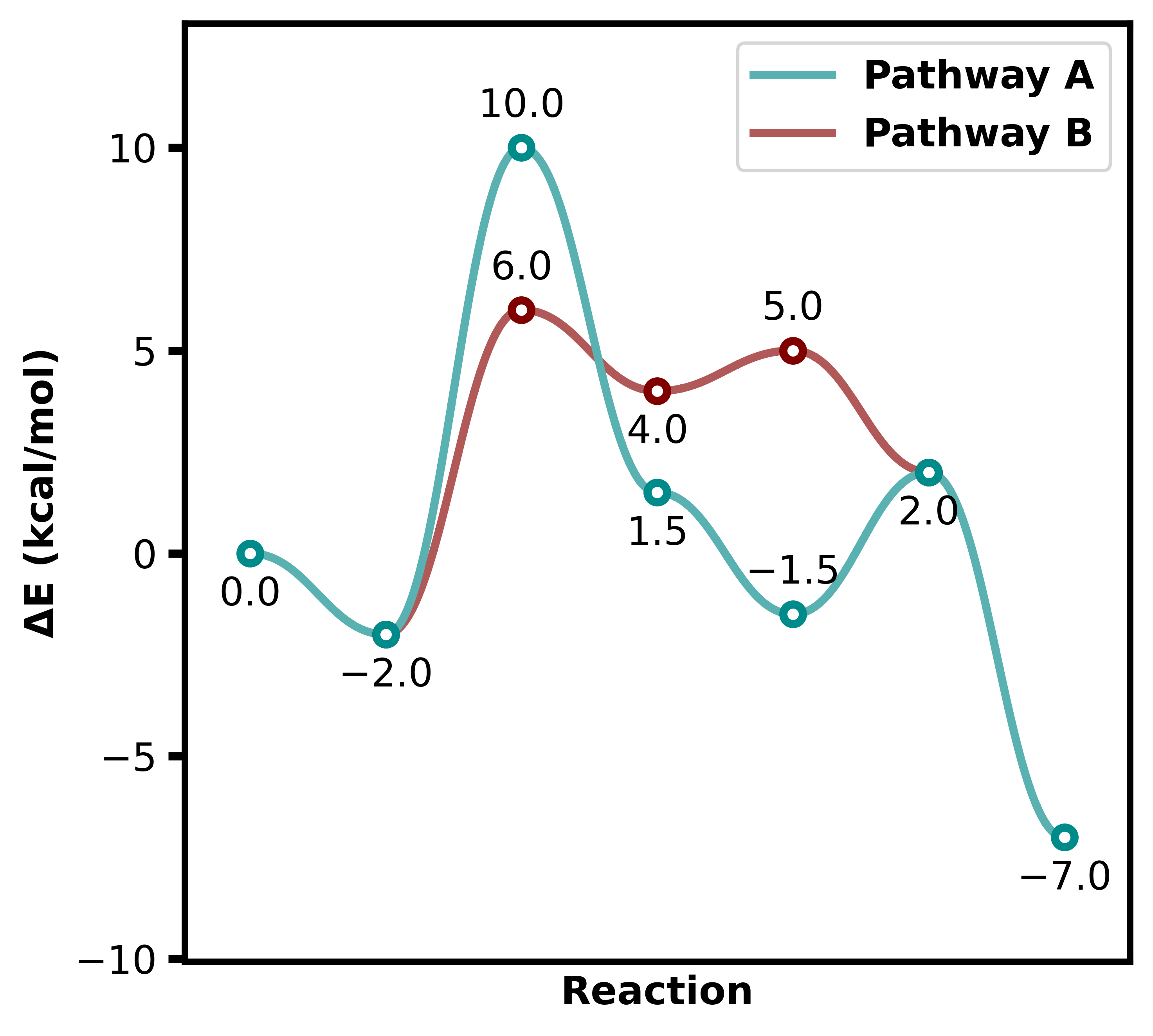
Axis labels can be fully customized:
x_labelandy_label, which override the labels completely.energycan bee|electronic|g|gibbs|h|enthalpy|s|entropyto automatically label the y-axis.unitssets the y-axis units: ‘kcal’ or ‘kj’.
plotter = ReactionProfilePlotter(
    energy='E',
    units='kcal',
    x_label='Reaction',
)
plotter.plot(energy_sets, filename="../images/profile14")
Parameter |
Value |
|---|---|
x_label |
Reaction |
energy |
E |
units |
kcal |
3. Legend Options
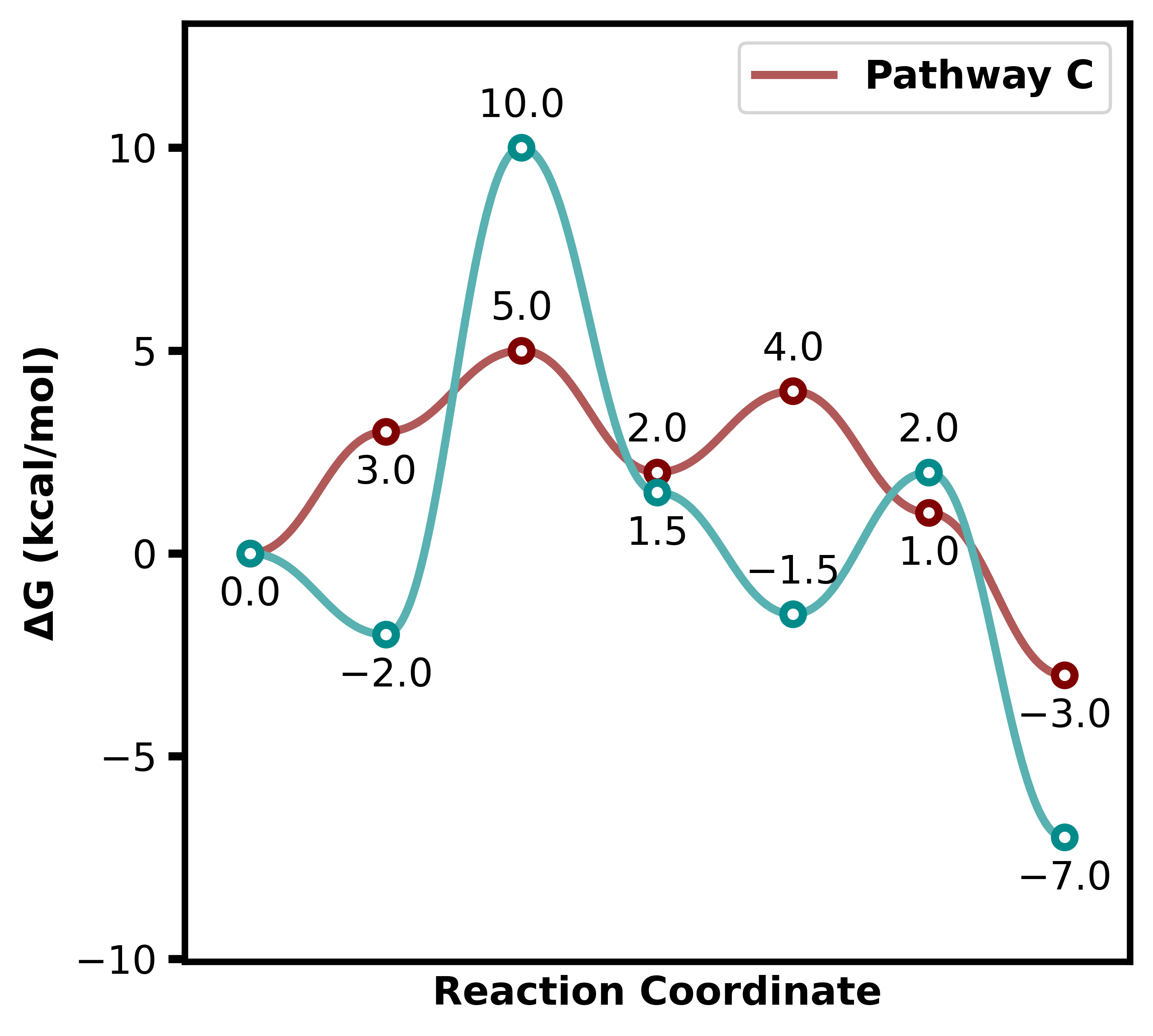
The legend can be turned on/off, and specific lines can be included or excluded:
show_legendtoggles visibility. Default isTrue. This is controlled in the class as a global parameter.exclude_from_legendhides specific lines. This is a plot function parameter.include_keysensures certain keys are plotted even if not in the energy list. This is also a plot function parameter.
energy_sets = {
    "Pathway A": [0.0, -2.0, 10.0, 1.5, -1.5, 2.0, -7.0],
    "Pathway B": [None, -2.0, 6.0, 4.0, 5.0, 2.0, None],
    "Pathway C": [None, None, 3.0, 5.0, 6.0, 1.0, -2.0],
}
plotter = ReactionProfilePlotter(
    show_legend=True,
)
plotter.plot(energy_sets, exclude_from_legend=['Pathway A'], include_keys=["Pathway A", "Pathway C"], filename="../images/profile15")
Parameter |
Value |
|---|---|
show_legend |
True |
exclude_from_legend |
[‘Pathway B’] |
include_keys |
[‘Pathway A’, ‘Pathway C’] |
The appearance of the legend itself is set with the legend dict, which is handed straight to matplotlib’s legend(), so loc, frameon, fontsize, ncols, title, framealpha, labelspacing, bbox_to_anchor and the rest all work.
Two keys are added on top of matplotlib’s:
outside- put the legend beside the axes rather than on them. DefaultFalse. Setslocandbbox_to_anchorfor you.anchor- how far right anoutsidelegend sits. Default1.02; about1.22clears a secondary axis and its label.
Warning
outside and loc interact. Once bbox_to_anchor is set, loc no longer means
“put the legend here” - it means “anchor this corner of the legend to the bbox point”. A
right-hand loc therefore pins the legend’s right edge beside the axes and the box
extends back over the plot. Use a left-hand loc ('center left', 'upper left'),
or drop outside to place the legend inside. Passing a right-hand loc with
outside=True warns.
and two defaults differ from matplotlib’s:
frameondefaults to on for an inside legend and off for an outside one, where the frame would just box empty space.fontsizedefaults to the plot’sfont_size.
The border is matplotlib’s: frameon, edgecolor, facecolor, framealpha, fancybox. So is the text colour: labelcolor.
The plot’s font is bold by default (font_weight in styles.json), and the legend inherits it so that it matches the axis labels. To change only the legend’s font, use matplotlib’s prop - either a dict of properties to override, which keeps the plot’s family and size, or a FontProperties to replace it outright:
# a non-bold legend on an otherwise bold plot
ReactionProfilePlotter(legend={"prop": {"weight": "normal"}})

# italic, and a size of its own
ReactionProfilePlotter(legend={"prop": {"weight": "normal", "style": "italic"}, "fontsize": 9})
fontsize wins over a size given in prop, as it does in matplotlib.
plotter = ReactionProfilePlotter(
    labels=False,
    legend={
        "loc": "lower left",
        "frameon": True,
        "edgecolor": "maroon",
        "facecolor": "whitesmoke",
        "labelcolor": "darkcyan",
        "prop": {"weight": "normal"},
        "fontsize": 9,
    },
)
plotter.plot(energy_sets, filename="../images/profile25")
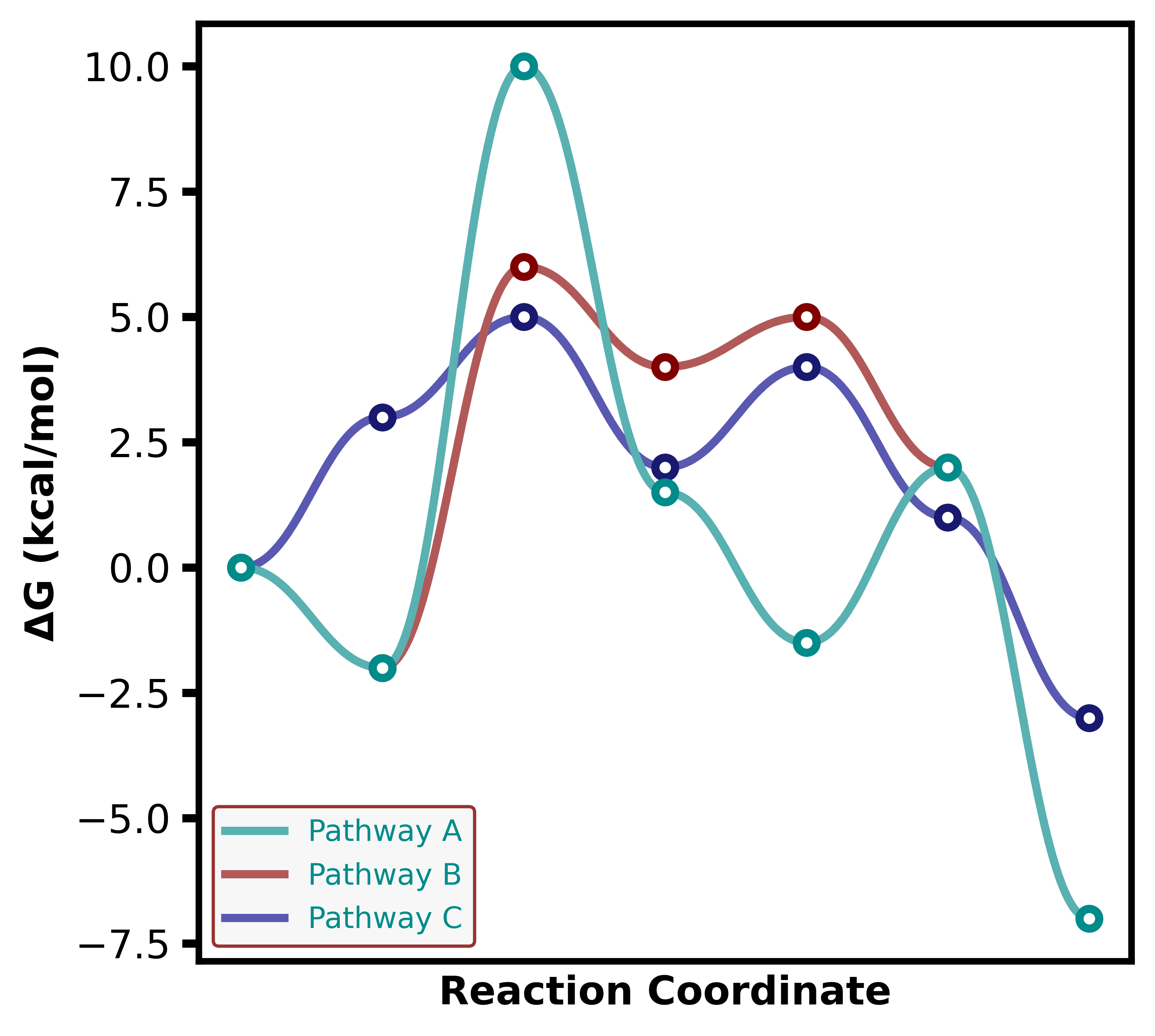
See Secondary Axis for an outside legend carrying series from both axes.
4. Point Types
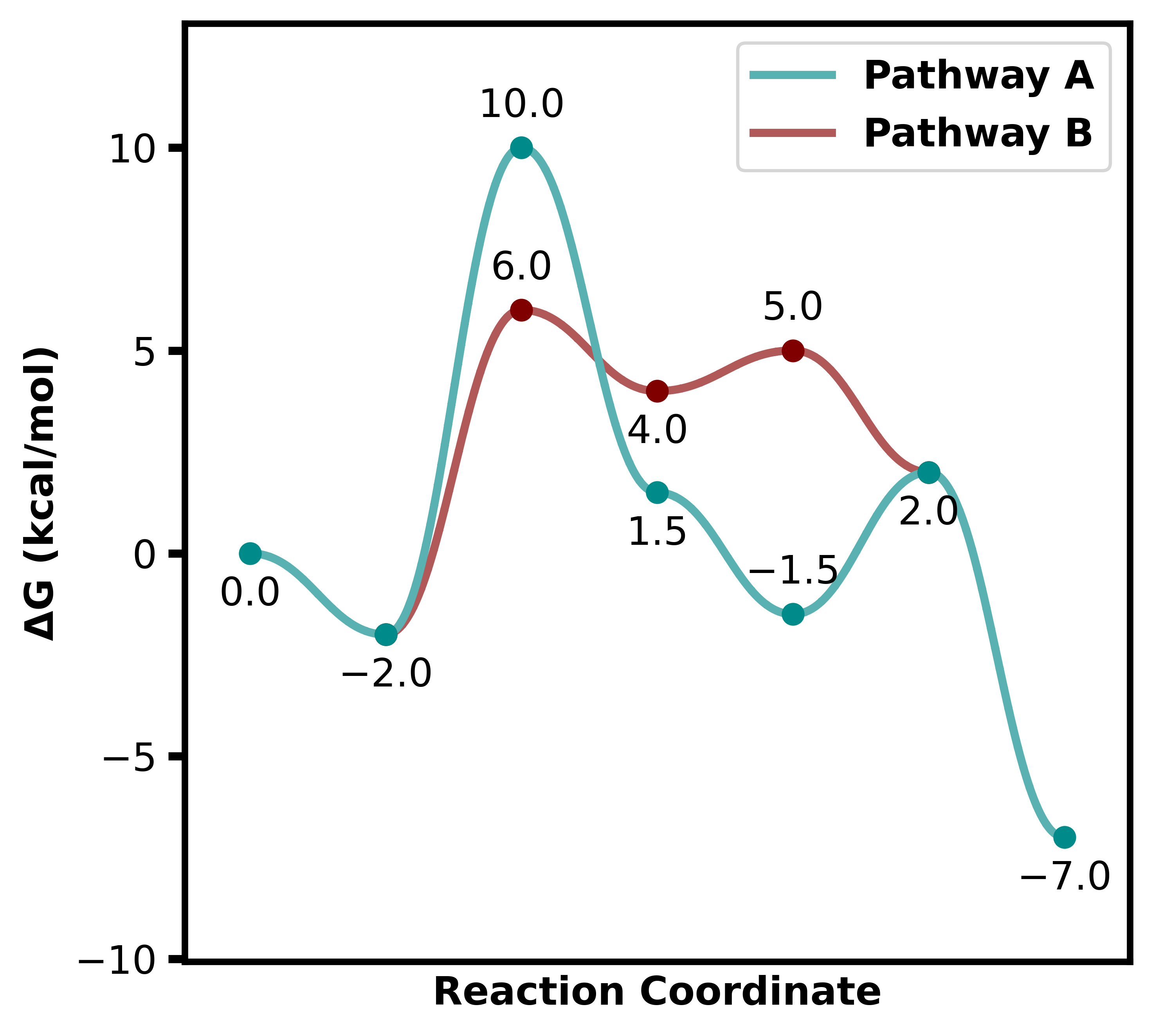
Point styles can be selected with point_type:
Options: ‘hollow’, ‘dot’, ‘bar’.
plotter = ReactionProfilePlotter(point_type='dot')
plotter.plot(energy_sets, filename="../images/profile16")
Parameter |
Value |
|---|---|
point_type |
dot |
5. Bar Plot Customization
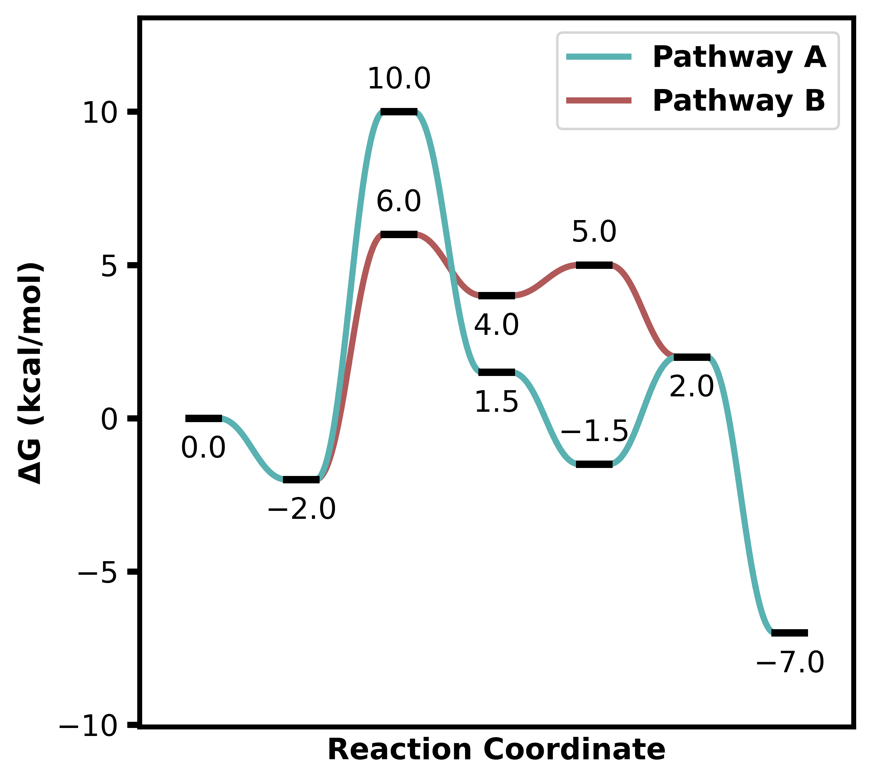
Bars have additional options:
bar_lengthandbar_widthcontrol size.connect_bar_endsdetermines if lines connect to the bar center or ends.Default is
True
plotter = ReactionProfilePlotter(
    point_type='bar',
    bar_length=0.8,
    bar_width=0.3,
    connect_bar_ends=True
)
plotter.plot(energy_sets, filename="../images/profile17")
Parameter |
Value |
|---|---|
point_type |
bar |
bar_length |
0.8 |
bar_width |
0.3 |
connect_bar_ends |
True |
6. Line Styles
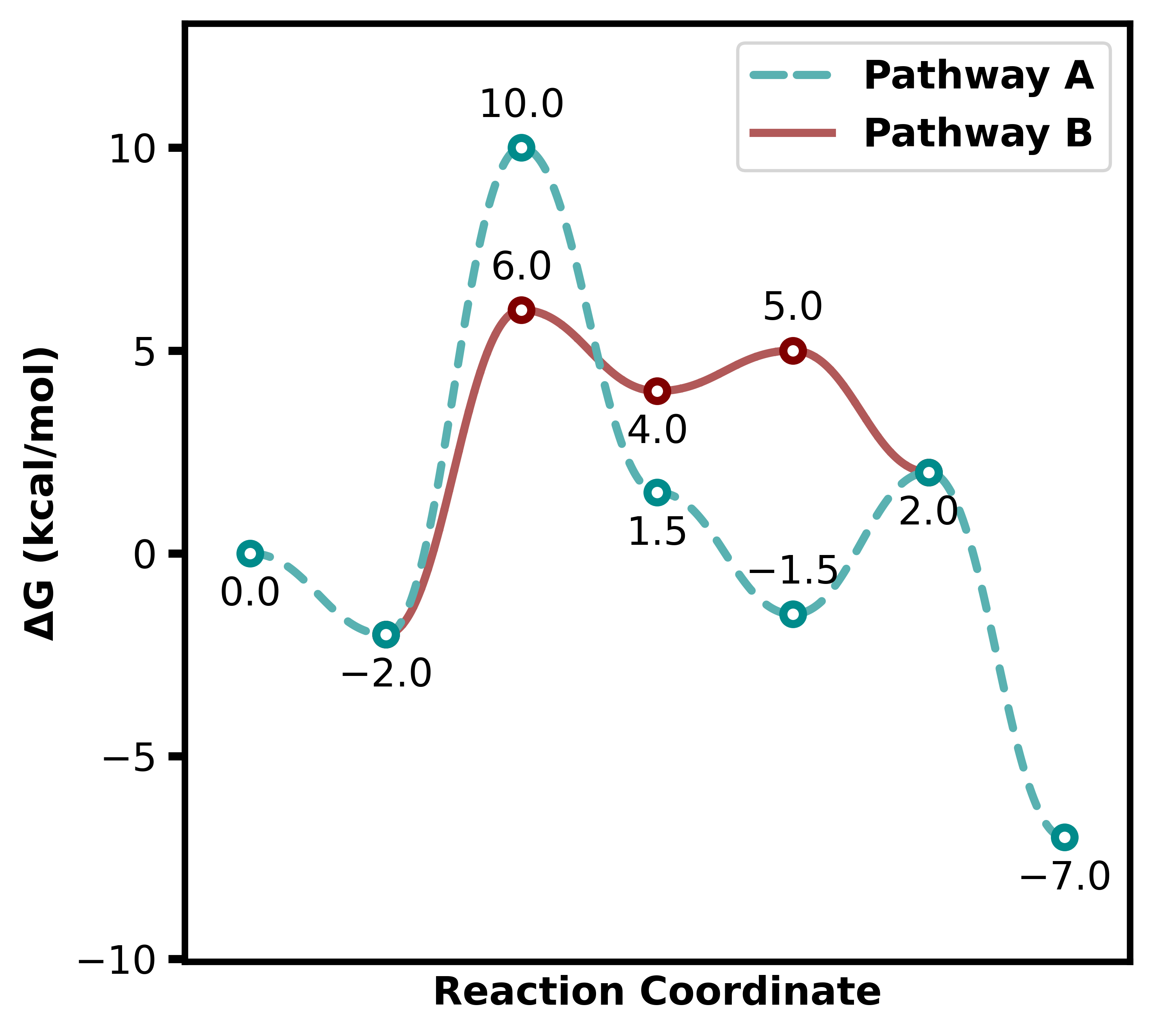
linestyle takes a matplotlib linestyle for every series on the axis, or a dict of them keyed by series label.
'--' and solid are the package’s own presets: the dash scales with the line and is spaced by dash_spacing (default 2.5), with round caps, which looks better on a curved profile than matplotlib’s default dash. Any other matplotlib spec - '-.', ':', or an explicit (offset, (on, off)) tuple - is passed through untouched, so the full set is available.
plotter = ReactionProfilePlotter(linestyle={'Pathway A': '--'})
plotter.plot(energy_sets, filename="../images/profile18")

# mixing the preset with matplotlib's own
ReactionProfilePlotter(linestyle={'Pathway A': '--', 'Pathway B': '-.'})

# one style for every series on the axis
ReactionProfilePlotter(linestyle=':')
Parameter |
Value |
|---|---|
linestyle |
{‘Pathway A’: ‘–‘} |
dash_spacing |
2.5 |
7. Line Curviness
The curviness parameter uses Bezier curves to control line curvature:
0.0 → straight lines
0.0–1.0 → increasing curvature
plotter = ReactionProfilePlotter(curviness=0.7)
plotter.plot(energy_sets, filename="../images/profile19")
Parameter |
Value |
|---|---|
curviness |
0.7 |

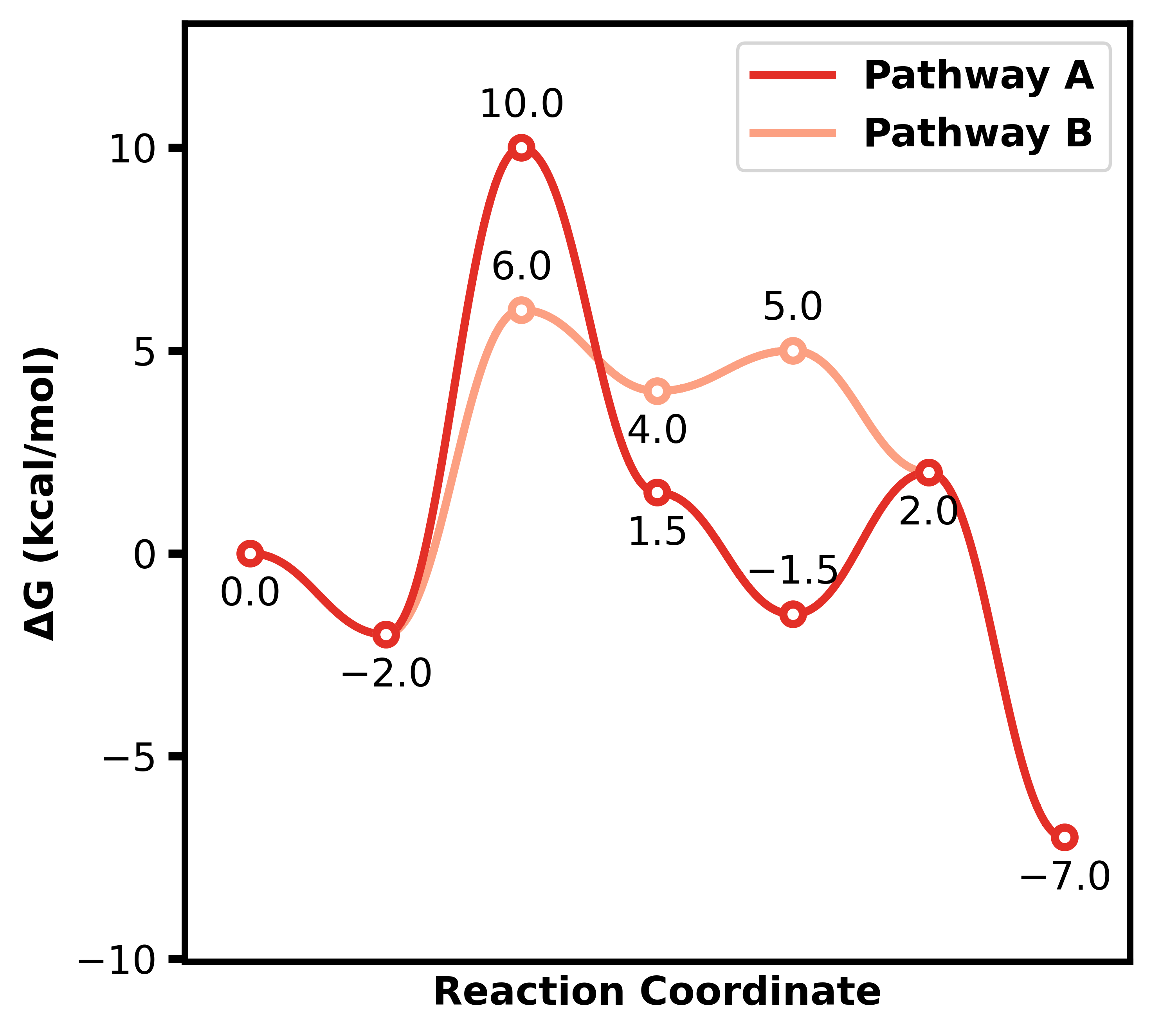
8. Colors
Colors can be customized:
Pass a list of named colors (will cycle if fewer than energy sets, truncate if longer).
Alternatively, pass a string of a colormap i.e. ‘viridis’, ‘plasma’, ‘blues’, ‘reds_r’, etc.
plotter = ReactionProfilePlotter(
    # colors=['red','green','blue'],
    colors='Reds_r'
)
plotter.plot(energy_sets, filename="../images/profile20")
Parameter |
Value |
|---|---|
colors |
Reds_r |
9. Saturation
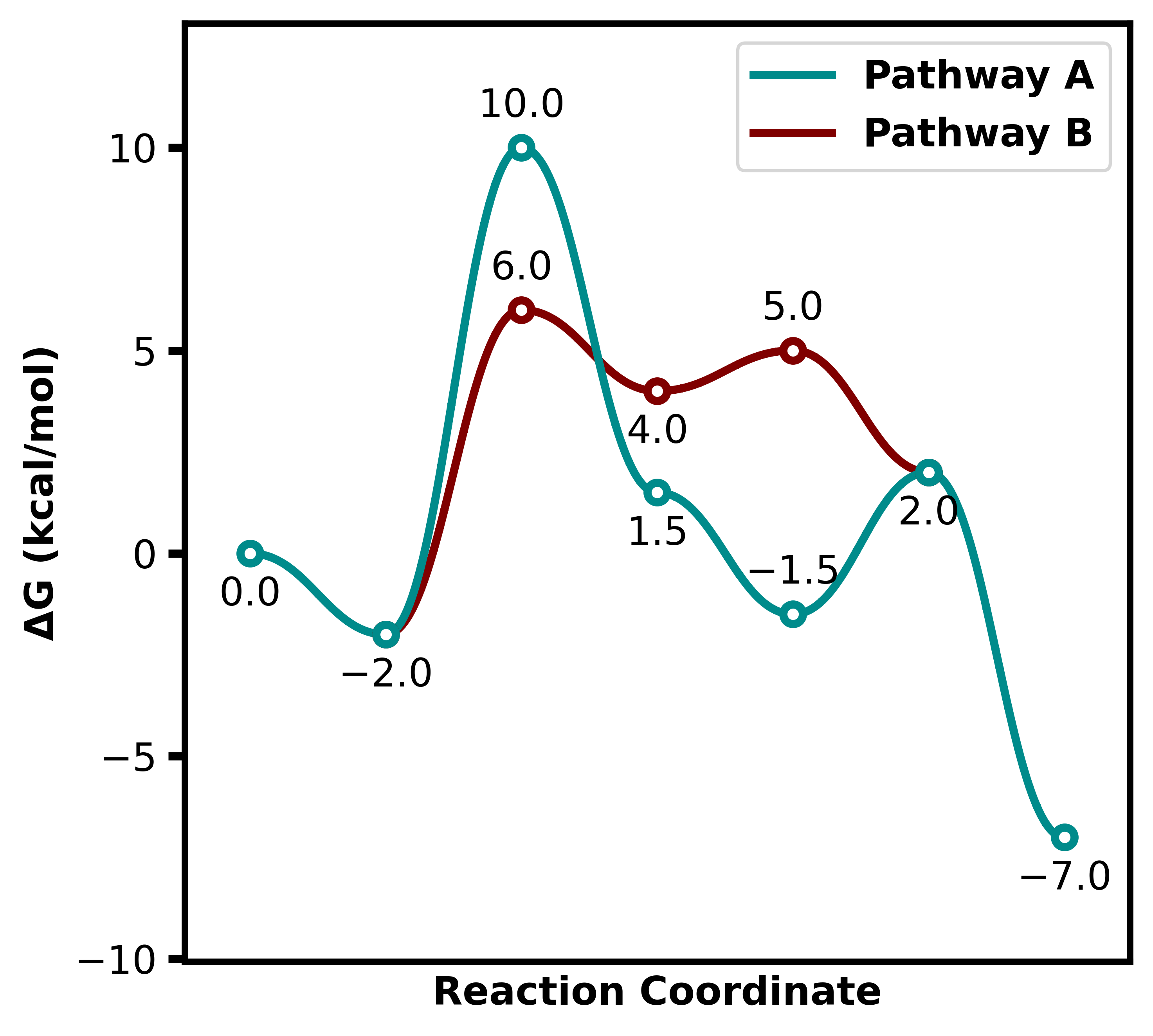
By default, the color of the lines are desaturated slightly relative to the points. This can be turned off with the desaturate parameter.
This can also be controlled with
desaturate-factorwhich is a float from 1.0 where this is the original increasing to increase desaturation.default is 1.2
plotter = ReactionProfilePlotter(desaturate=False)
plotter.plot(energy_sets, filename="../images/profile21")
Parameter |
Value |
|---|---|
desaturate |
False |
10. Annotations
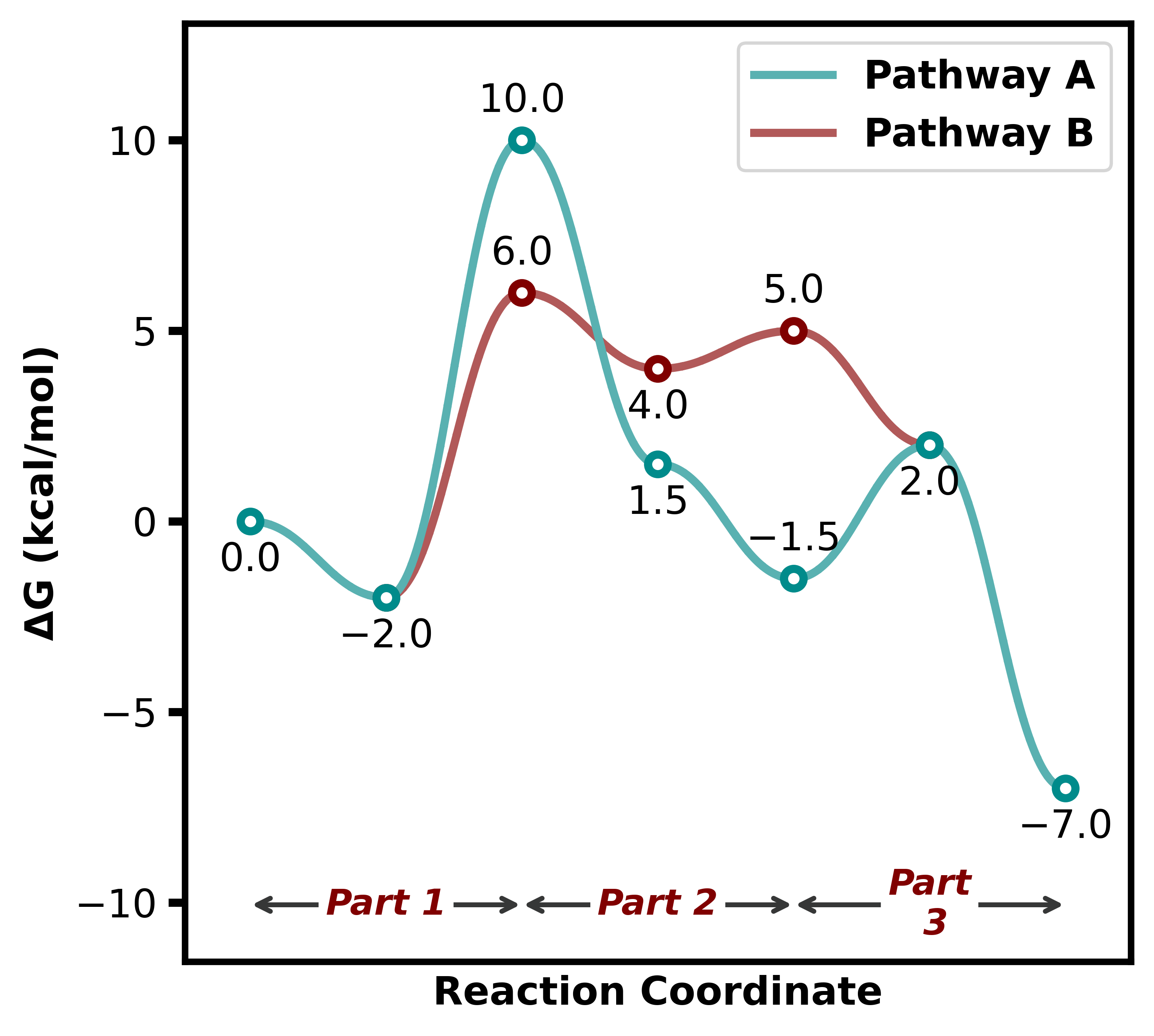
Annotations can be added to the plot using the annotations parameter in the format:
dict{ ‘Annotation’: (start_index, end_index) }
This adds an arrow at the bottom, with the text centered on the arrow.
The arrow color can be set with
arrow_color.The annotation text color can be set with
annotation_color.The annotation text size can be set with
annotation_size.Additional options include
annotation_below_arrowto place the text below the arrow instead on on the arrow.
annotations = {
    "A": (0, 1),
    "B": (2, 3),
    "C": (4, 5)
}
plotter = ReactionProfilePlotter()
plotter.plot(energy_sets, annotations=annotations, filename="../images/profile22")
Parameter |
Value |
|---|---|
annotations |
{‘A’: (0, 1), ‘B’: (2, 3), ‘C’: (4, 5)} |
arrow_color |
xkcd:dark grey |
annotation_color |
maroon |
annotation_size |
11 |
11. Labels
Labels of points can be added in the following way:
Pass a dict(list) of strings to the
point_labelsparameter.The keys are the energy set names, and the values are lists of labels for each point.
point_labels = {
    "Pathway A": ["Int1", "Int2", "TS1", "Int3"],
    "Pathway B": [None, None, "TS2" ]
}
plotter = ReactionProfilePlotter()
plotter.plot(energy_sets, point_labels=point_labels, filename="../images/profile23")
Parameter |
Value |
|---|---|
point_labels |
{‘Pathway A’: [None, ‘TS1’, ‘Int1’, ‘TS2’]} |